
Mobile SEO: How Mobile Experience Affects Visibility and Conversion
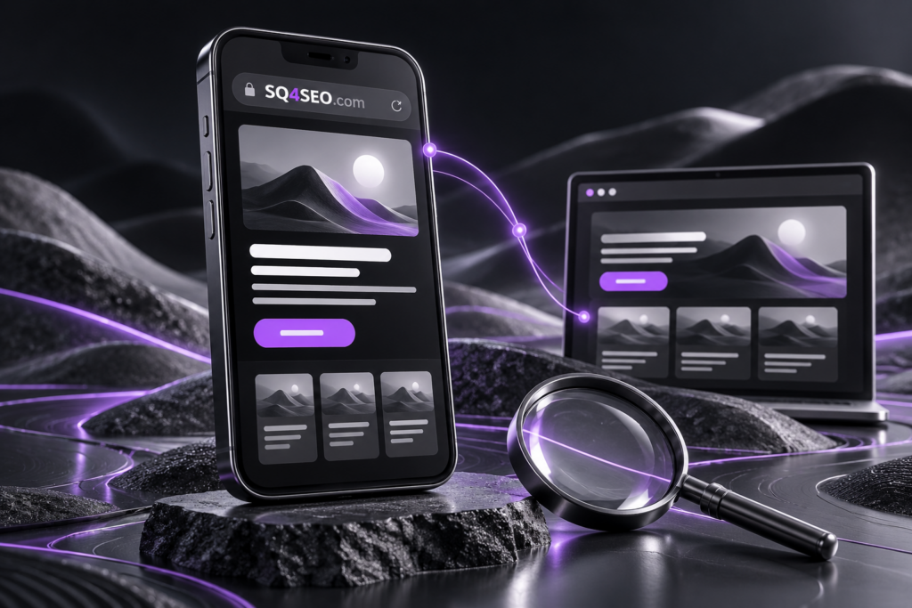
Mobile experience is a core part of website quality. For many businesses, a large share of visitors arrive on phones, and Google uses the mobile version of a page for indexing.
What is Mobile SEO?
Mobile SEO means making sure users and search engines can access the same essential content and complete important actions efficiently on smaller screens.
Responsive design
Responsive layouts allow the same page to adapt across screen sizes without creating unnecessary duplicate versions. Navigation, forms, buttons and media should remain clear and usable.
Keep important content available
A common mistake is hiding key sections on mobile or serving a much thinner version. Important information should remain accessible in a mobile-friendly presentation.
Performance on real devices
A page may feel fast on a desktop and still be slow on a mid-range phone or weaker connection. Review media, scripts, fonts and initial loading. See our guide to website speed and Core Web Vitals.
Buttons and forms
Calls to action should be easy to tap, forms should be short and readable, and input types should match the information being requested.
Avoid intrusive overlays
Popups or elements that block most of the screen can make content difficult to access. Calls to action should support the journey rather than interrupt it.
Navigation and internal structure
Mobile menus should surface the most important sections quickly, while internal links should preserve the relationship between service pages and supporting content.
How to test Mobile SEO
- Test on multiple screen sizes.
- Review mobile Core Web Vitals.
- Check tap targets and spacing.
- Confirm essential content is visible.
- Review Search Console indexing.
- Measure mobile conversions.
Conclusion
The goal is not merely to be mobile-friendly. The mobile user should be able to read, compare, contact or convert without friction. Mobile SEO therefore belongs to both Web and Digital Assets and SEO and Organic Growth.
